
COSTIGO
Role: UX/UI Designer, UX Researcher
Tools: Figma, FigJam, Google Forms, Pencil & Paper
Times: 2 weeks
Travel Cost Estimator App
Why
ostigo?
Costigo was born out of my own frustration while planning vacation, constantly switching between tabs, calculating costs manually, and still feeling unsure about what the whole trip would really cost.
I worked on this end-to-end project over two weeks. This case study walks through how I approached the problem, what I learned, and how I tried to bring clarity to a confusing part of travel.

What's the
Problem?
When planning a trip, the first question most people ask isn’t “Where should I go?” — it’s “Can I afford it?”
But current travel platforms focus on booking, not budgeting.
There’s no simple way to see approximate trip costs based on personal preferences like flights, stay, or transport.
Solution
Costigo solves this by giving users a quick, simple estimate of travel costs based on their own preferences, before they even start booking.
Design Process


Empathize
Define
Ideate
Design
Test


EMPATHIZE
User Research
I started by conducting a survey with 50 participants to understand how people estimate travel costs today. I focused on identifying pain points, tools they use, and where confusion arises.

“There is so much info, I get lost easily”
“What about food and local transport? How can I ever calculate that!”
“I have about 30 tabs open in my browser”
DEFINE
User Persona


Who are the Competitors?

Kayak Trip Huddle
Budget Your Trip
v/s
COSTIGO
User Flow

Preferences → Destination → Estimate
I wanted the experience to feel lightweight and non-committal, something you could use in 2 minutes and leave with a rough idea of the cost.
IDEATE
Wireflows
I started with quick sketches to explore layout and flow, focusing on how to make cost estimation feel light and intuitive. These helped me decide on a clean, linear experience that guides users without overwhelming them.


DESIGN
TESTING
Usability Testing
1.
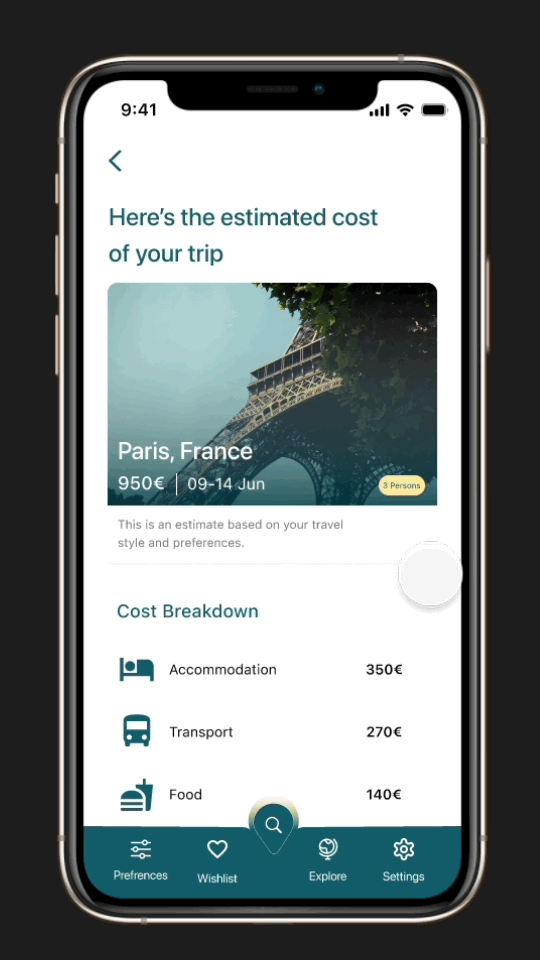
Once Prototype was ready, I tested it with 10 users and one major insight was around the cost breakdown layout. Users found the new bill-style format more intuitive and realistic - it helped them quickly understand where their money would go, instead of interpreting icons or percentages. This small shift made the data feel more trustworthy.


2.
Another key finding came from the exploration section. Originally designed with a horizontal scroll for destination cards, users struggled to compare locations and often missed content entirely. Switching to a vertical layout allowed users to view more destinations at once, making it easier to scan and compare trips without extra effort.


UI Design
Color Palette
I created a color palette with 1 primary , 2 secondary colors, and other neutral tones for background, borders, and typography.
A vibrant red was used selectively to highlight interactive elements like the like button, ensuring visual interest without disrupting the overall calm tone.

Aa

For typography, I chose SF Pro, a native iOS typeface, to keep the design aligned with platform guidelines and ensure excellent legibility across sizes.
Typography
Default
Buttons
Clicked
Disabled


Navigation bar

Icons


Overlay

Search Bar & Input fields


Toast message

Cards


Accessibility
I followed WCAG AA standards to ensure sufficient contrast across all UI elements. Interactive components like buttons and cards were sized with touch targets ≥44px, and I kept typography legible with consistent hierarchy and spacing.


Color was never the only means of conveying information, and iconography was paired with labels to support better understanding across user groups. Accessibility wasn’t an afterthought, it was part of the design from day one.
© 2025 Created by Smitha Nittur